























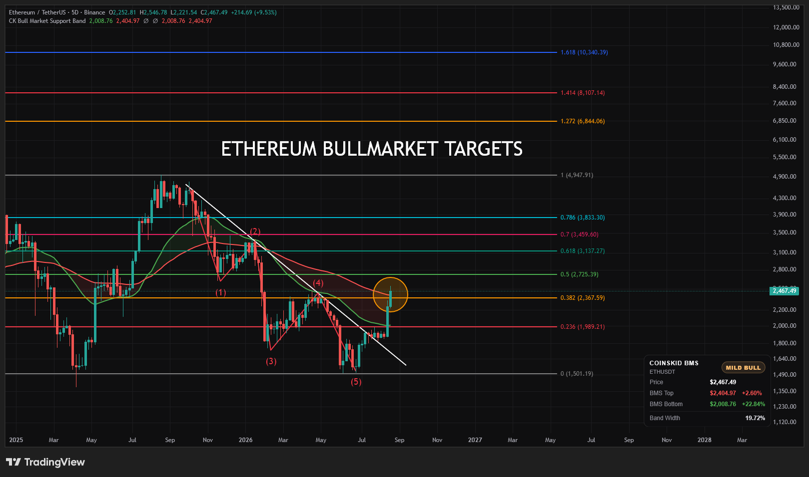
ETH Ethereum Bull Market Targets
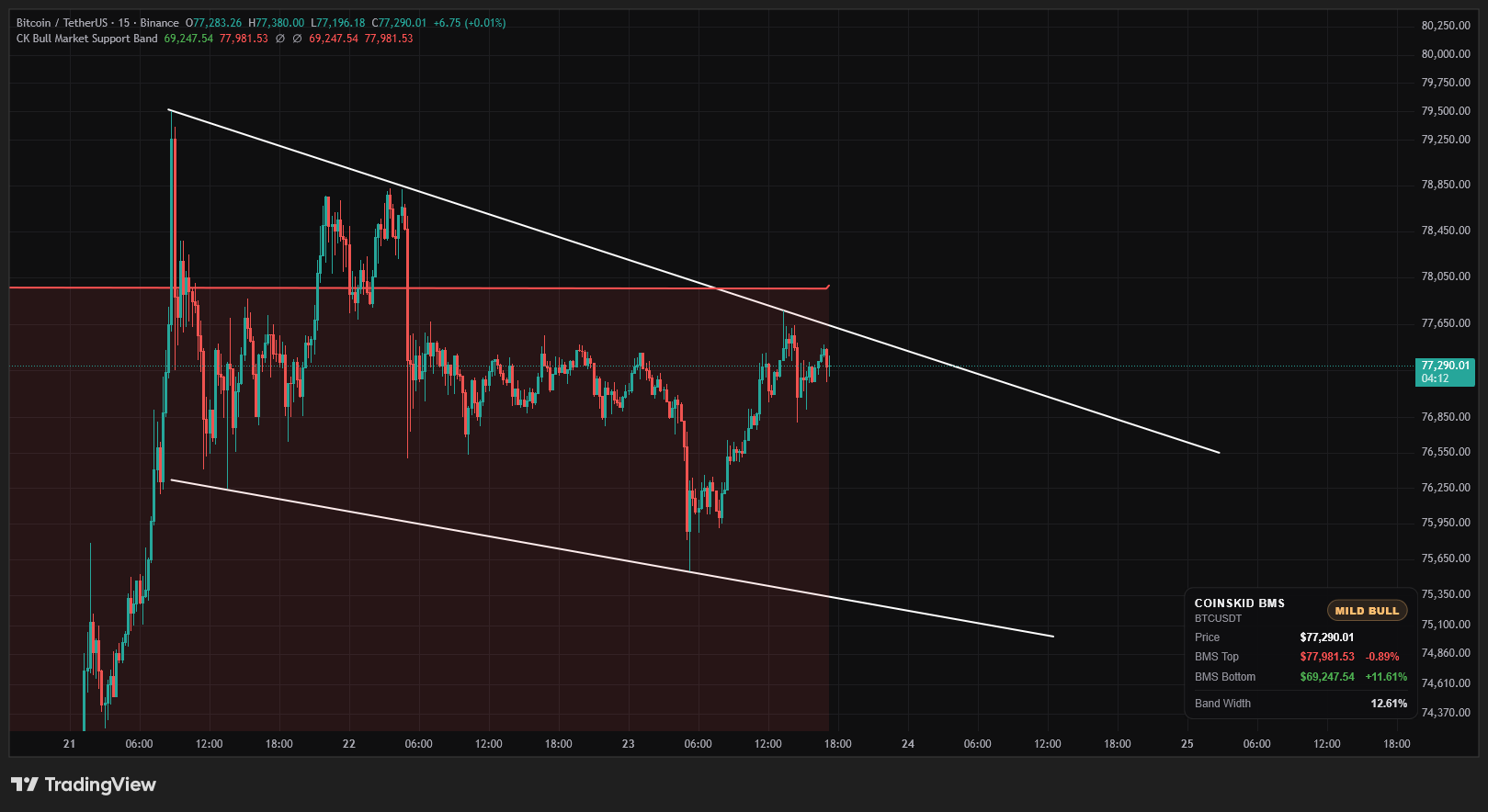
Providing we can see ETH hold the 0 fib there is a chance we could see a big run to the upper fib extension trargets in the next bull market. ETH is breaking a downwards tendline after 5 waves down and is also trying to get above the BMS


 CoinsKid.Com